SPIDER-MAN VIDEO TEMPLATESPIDER-MAN VIDEO TEMPLATE
PROJECTSpider-Man: Brand New Day
CLIENTSony
PLATFORMTikTok
TEAMTikTok Create · Template
ROLECreative Lead · Visual Direction · Storyboarding · Motion Design · Cross-functional Coordination
TIMELINEJune to July 2026
LAUNCHEDJuly 27, 2026 · the film opened July 31
TOOLSFigma · After Effects · TikTok Editor Pro
PRACTICE02ANIMATION & STORYTELLING· also 01
WITHA junior teammate developed the split-screen and comic-panel direction; we also explored concepts together. A production partner completed the final in-app assembly using the package I prepared.
Putting everyday moments inside a Spider-Man trailer
I led a 15-second TikTok template promoting Spider-Man: Brand New Day, from an open brief to an edit with 13 replaceable media slots.
As creative lead, I worked with a junior teammate on concepts, then created the storyboard and all animation and prepared the package for a production partner’s final in-app assembly.
PROBLEM
A 15-second trailer template had to make unrelated personal clips feel cinematic.
MY DECISION
I kept the comic-panel composition within existing mobile mask tools.
SHIPPED
I delivered the animation and asset package a partner used to assemble the template.
EVIDENCE
13 replaceable slots; 1.75M+ published videos by August 25, 2026.
THE numbers
Thirteen slots in fifteen seconds, so a camera-roll clip could share the frame with Spider-Man.
The campaign timing, the strength of the Spider-Man IP, and the wider launch support all contributed to its reach.
1.75M+published videos
Videos people made with the template from their own photos and clips, and posted on TikTok.
90M+video views
Times those videos were watched.
13replaceable slots
Places in the 15-second edit where a person’s own photo or video takes over the frame.
By August 25, 2026.
THE RESULT
THE 15-SECOND EDIT · OFFICIAL TRAILER FOOTAGE ONLY · DELIVERED
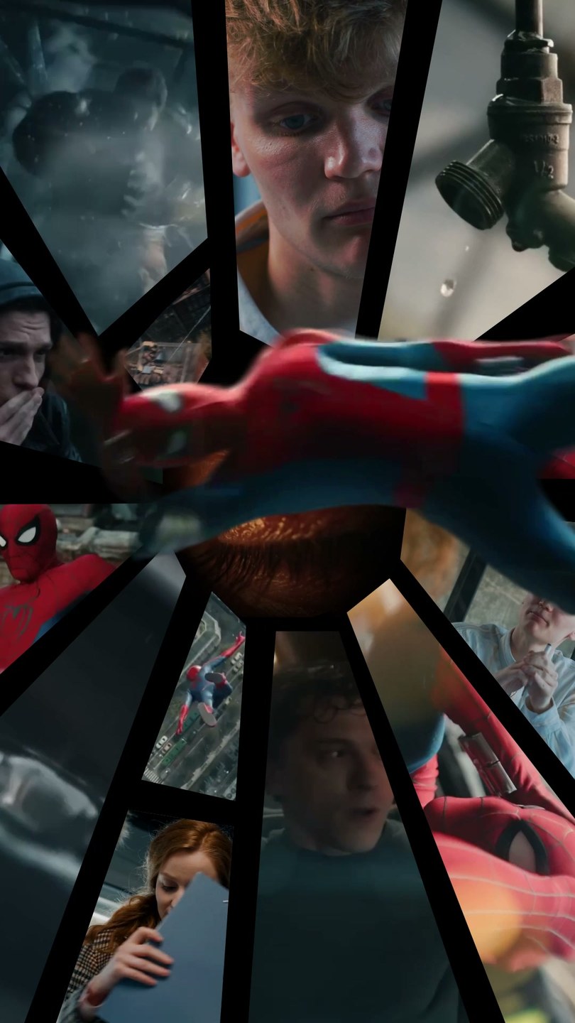
THE SAME EDIT · STOCK CLIPS STAND IN FOR A PERSON’S MEDIA · DEMO
A person’s own clips became part of the trailer.
I prepared two demos for client review: one cut entirely from official trailer footage, and one with stock clips in the replaceable slots to show how someone’s own media would sit inside it. Both kept the same rhythm, transformation arc and comic-inspired compositions.
CONTEXT
I treated “bright” as momentum rather than constant happiness.
Sony asked our team for a 15-second TikTok template that people could personalize with their own photos or videos. The brief set three themes, Brand New Day, Together and Metamorphosis, and a tone that was bright, hopeful, fun and participatory rather than dark. Its reference was a Netflix template that built customization into a cinematic composition.
Day to day, I owned the creative development and kept everyone moving together: Operations, client-facing partners, the Editor Pro tool team, and the production partner who would assemble it in the app.
The available Brand New Day footage was not purely upbeat. Much of it centered on Peter’s uncertainty, struggle, and transformation. I wanted to keep that tension and still give the edit enough energy and forward motion to feel inviting on TikTok.
The template could move through vulnerability, but it needed to land on survival and rebirth.
CREATIVE CHALLENGEHow could a 15-second template preserve the emotional world of the trailer while making unrelated user media feel as if it belonged inside it?
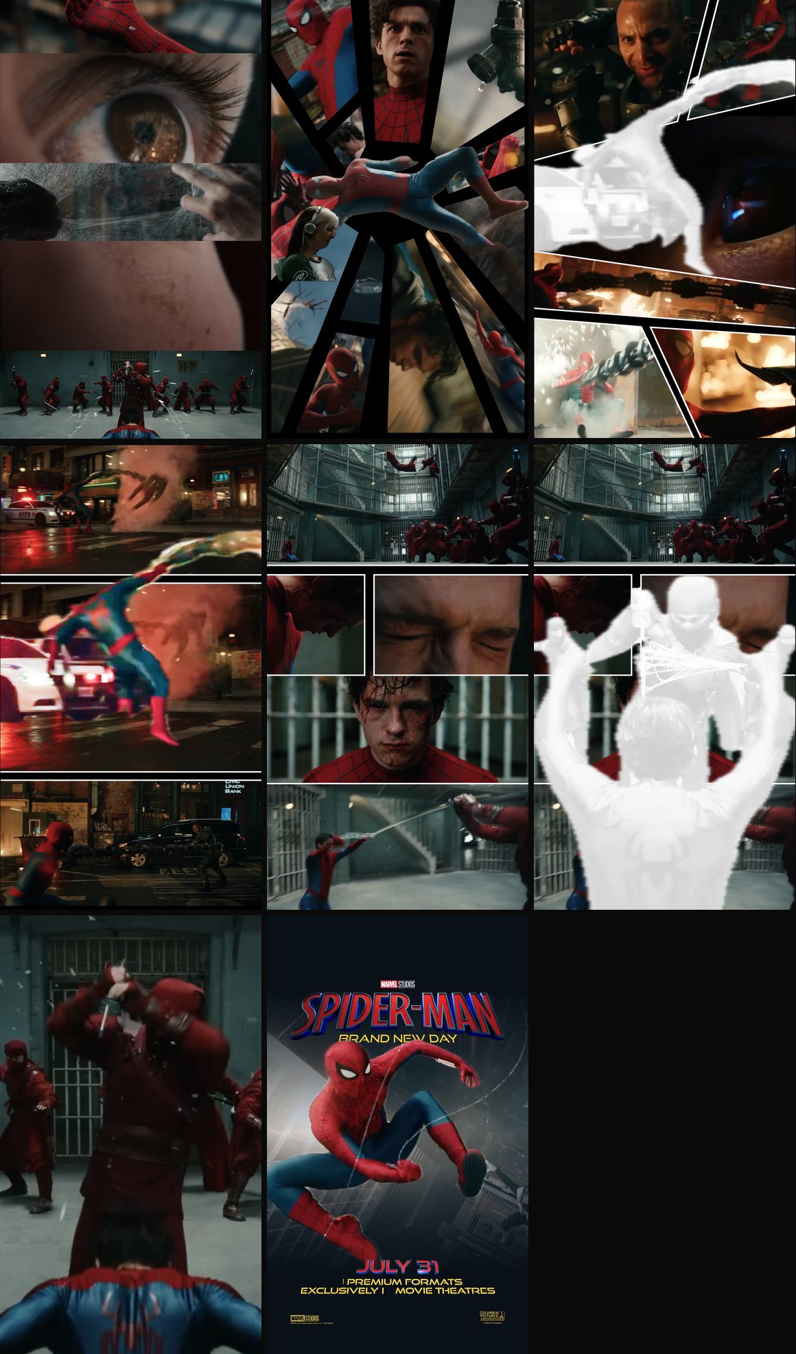
THE OPENING · OFFICIAL TRAILER FOOTAGE
THE SAME OPENING · STOCK CLIPS STANDING IN FOR A PERSON’S MEDIA
ONE TEMPLATE · 15 SECONDS
BRAND NEW DAY
A story arc, 13 media slots, and a production package built for a partner to assemble on a phone.
RUNTIME
15 seconds
IDEAS EXPLORED
Seven, narrowed to four
FIRST REVIEW
Concept and both demos approved
STEP 01
LEADING THE PROJECT FROM BRAINSTORM TO DELIVERY
I structured our brainstorm and carried the selected direction through production, preparing a package for final assembly in the mobile editor.
Before anyone pitched an idea, I built the brainstorm document: the project background, early AI-model research, and a format for explaining each concept with references.
During concept development, we explored the directions together, discussing how story, pacing, and replaceable media could work in a 15-second template.
Together we developed six directions and explored a seventh suggested by our client-facing partners, then narrowed the set to four for the Operations review. My teammate’s split-screen transitions and comic-panel language became part of the final concept.
Once the direction was chosen, I carried it through storyboard, visual design, all animation, technical problem-solving and cross-functional review, then prepared detailed assembly notes and handed it to a production partner for the in-app build.
STEP 02
FINDING THE STORY INSIDE THE TRAILER
One line fans read as a hint about the movie gave the edit its spine: Three Life Cycles.
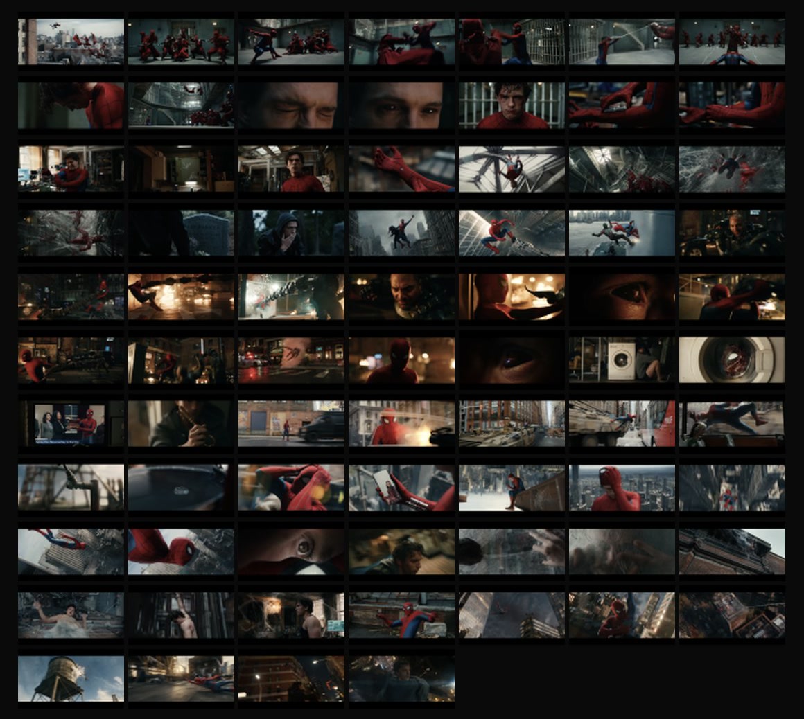
Before designing the storyboard, I studied both official trailers shot by shot. I also revisited the previous films, watched trailer analysis, and followed fan discussion around a line that appeared to hint at the movie’s direction: spiders have three life cycles.
The passage moves from vulnerability between cycles to surviving and being reborn. I used that arc to give the fifteen-second edit a beginning, middle, and end, and connect it to Metamorphosis, one of the brief’s three themes.
I used shot detection to break both trailers into scenes and sorted them against each beat, so I could build a new 15-second sequence instead of shortening an existing trailer.
02 · TRAILER SHOTS · SELECTED
0s1s2s3s4s5s6s7s8s9s10s11s12s13s14s15s
Spiders have three life cycles.
When between cycles, it can leave the spider vulnerable to threats.
1 BETWEEN CYCLES2 VULNERABLE
And for those spiders who make it through
it amounts to a kind of
rebirth.
3 REBIRTH
02 · THE VOICEOVER LINE ACROSS THE 15 SECONDS, FROM THE STORYBOARD
STEP 03
COMBINING STORY WITH VISUAL MOMENTUM
Sony approved the concept and both demo versions in the first review.
One early idea put any user behind Spider-Man’s mask, but the AI portrait tests did not produce consistent results. We dropped it before production to keep the character recognizable.
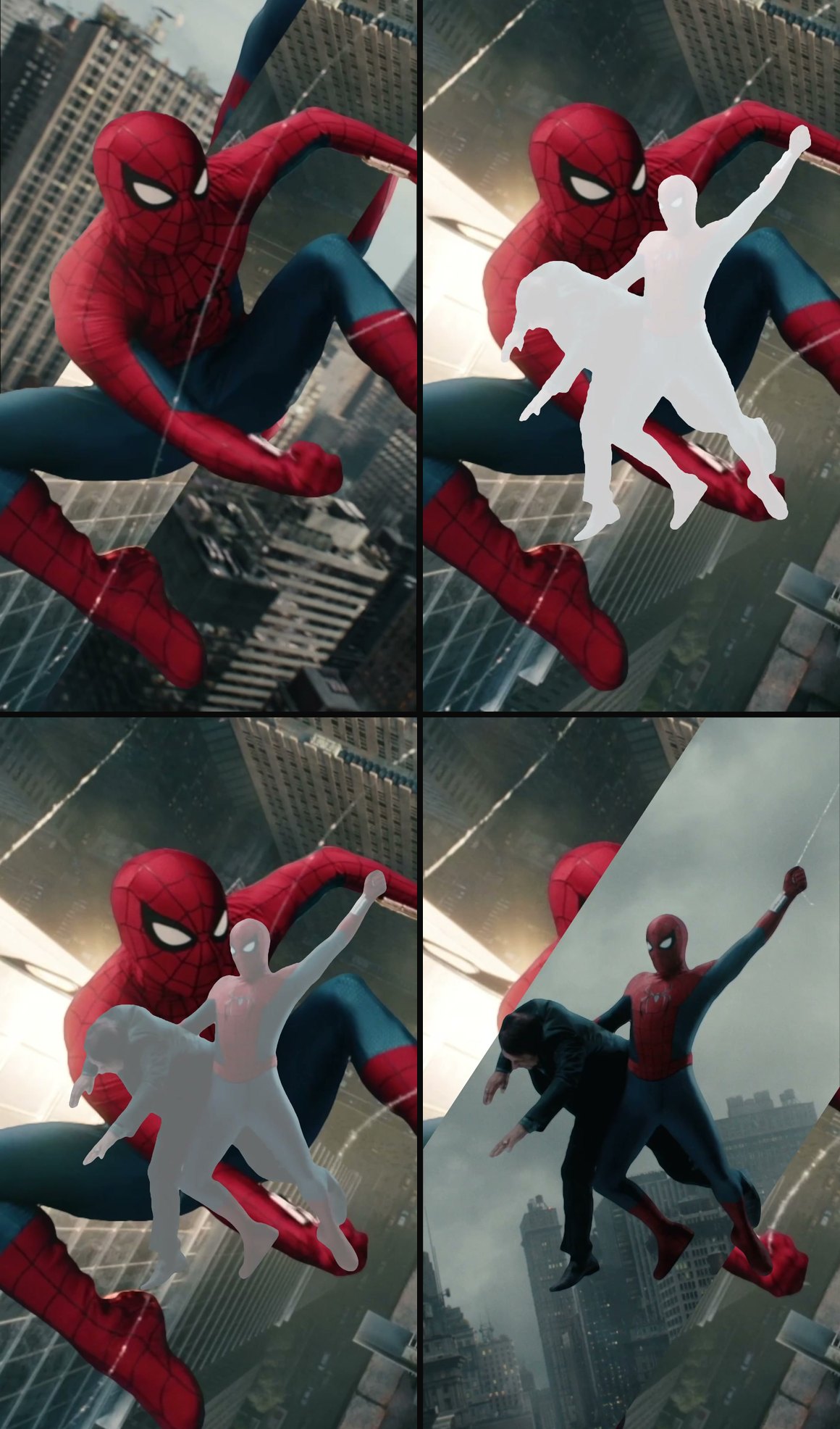
My teammate developed the fast split-screen transitions and comic-panel language. I combined her direction with my Three Life Cycles story arc and the character cutouts from our shared poster-style concept.
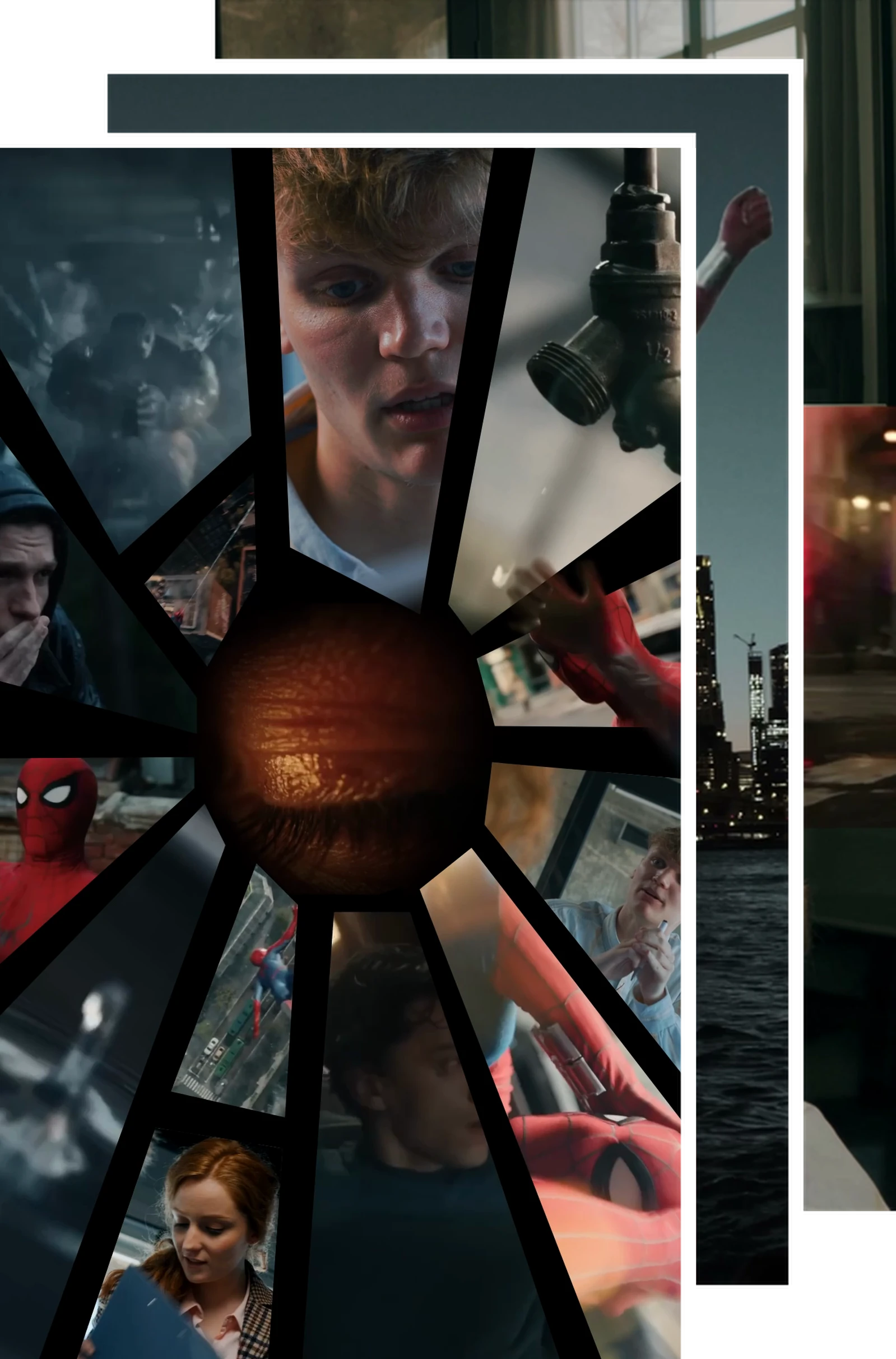
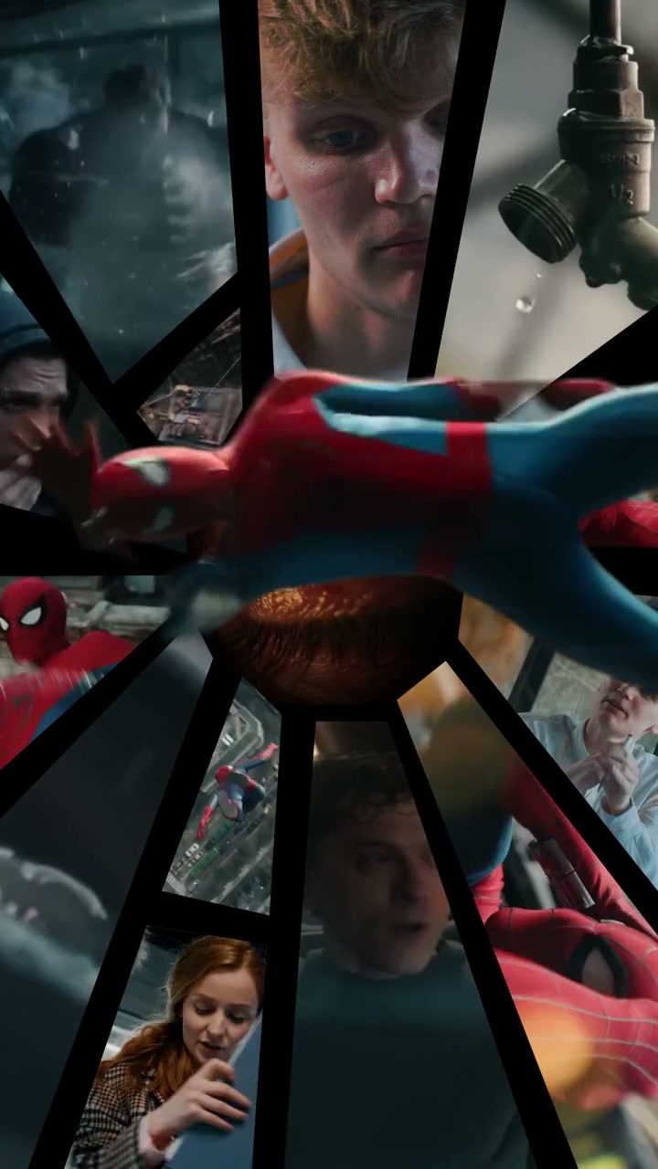
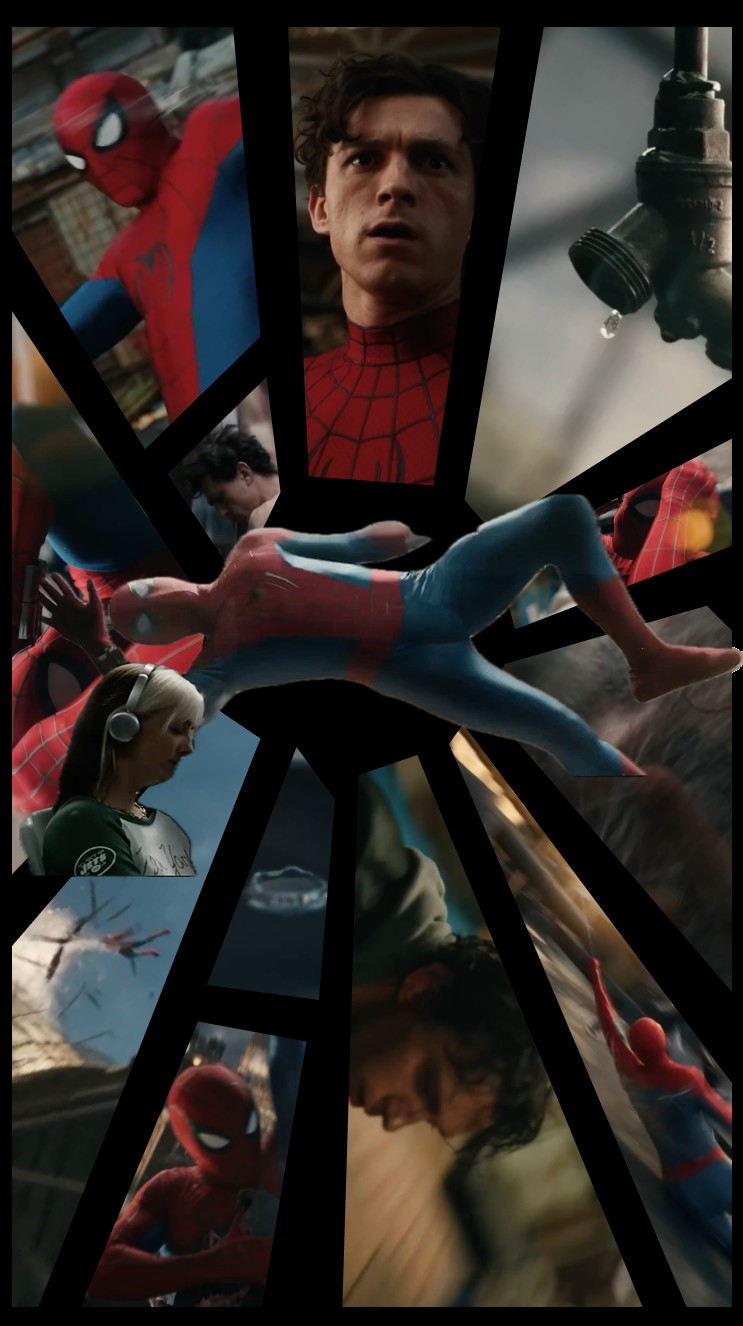
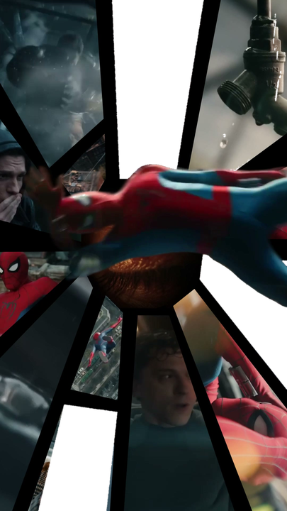
I kept the comic-panel language restrained: characters stay at the center while the images around them split and radiate outward like a web. That packed several moments into a few seconds and kept the look tied to Spider-Man’s comic-book roots.
Together, these three directions gave the fifteen-second edit its story arc, visual rhythm, and character-led compositions.
03 · ONE TRANSITION, FRAME BY FRAME · SPLIT-SCREEN AND COMIC-PANEL DIRECTION: MY TEAMMATE
03 · STYLE FRAMES IN STORY ORDER
STEP 04
MAKING PARTICIPATION FEEL CINEMATIC
I wove people’s own photos and videos through the edit so even random camera-roll material could inherit the pace and drama of the trailer.
The Netflix reference in the brief did not put user media in obvious photo frames. It built that media into the cinematic composition, so the piece read as a trailer first.
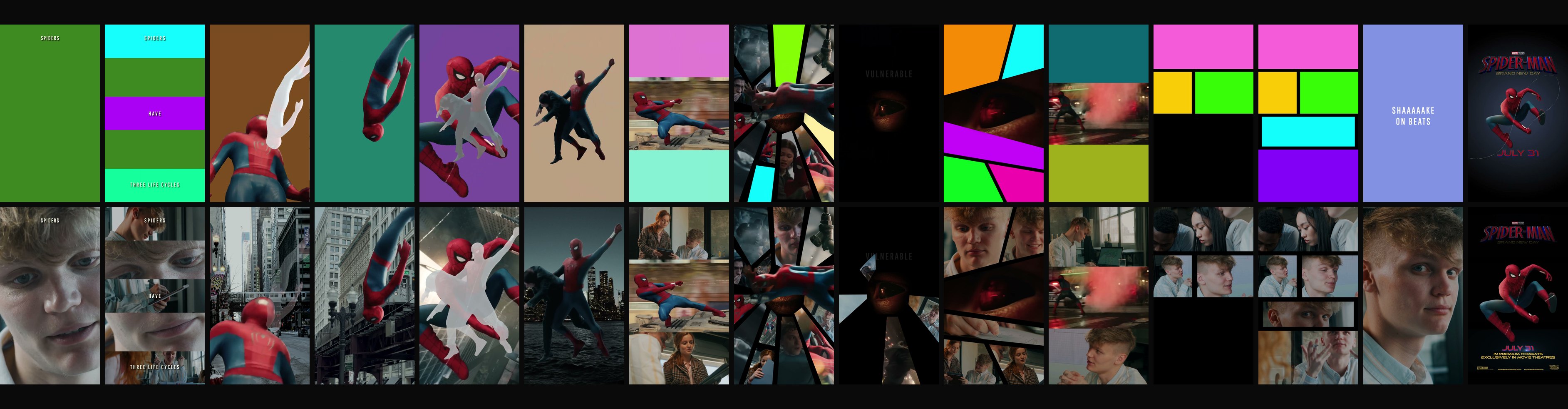
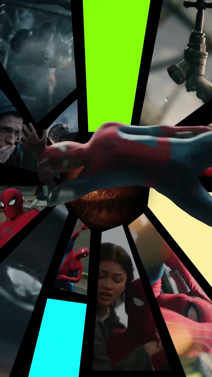
I applied the same principle: 13 replaceable media slots spread across the edit, some behind cutout characters, others arriving through split screens, masks and rapid transitions. Reusing several uploads in more than one place added continuity without asking people for more media.
The slots were never meant as thirteen stages of someone’s life. Three Life Cycles shaped the edit itself.
04 · BEHIND A CUTOUT CHARACTER
04 · INSIDE MASKED COMIC PANELS
04 · THE 15 SECONDS, LEFT TO RIGHT · TOP: THE SLOT MAP, A FLAT COLOR WHEREVER A PERSON’S MEDIA GOES · BOTTOM: THE SAME FRAMES IN THE USER-MEDIA DEMO
STEP 05
DESIGNING AROUND PLATFORM LIMITS
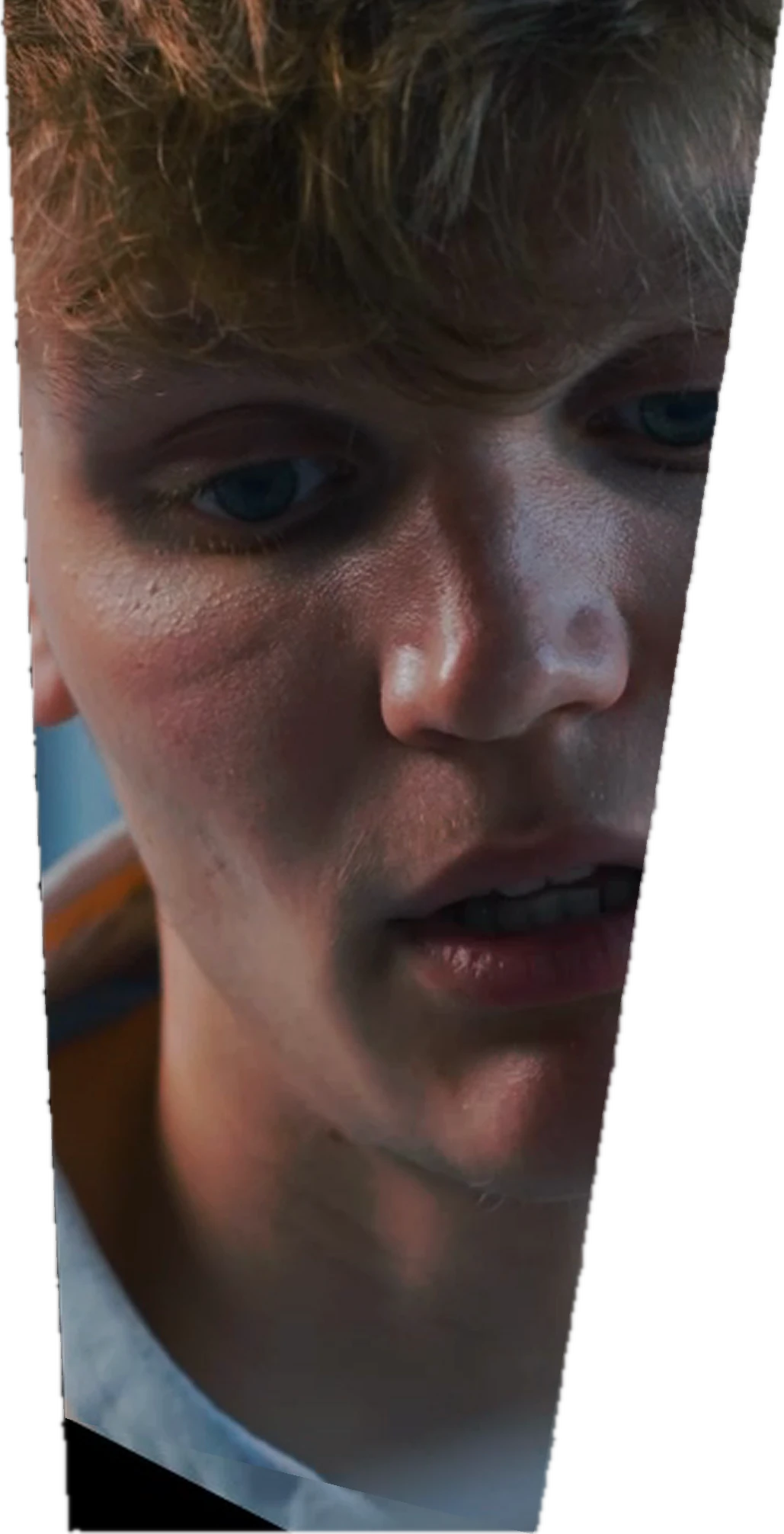
Editor Pro could not make the masks this frame needed, so I shipped it with fixed trapezoid masks and pre-rendered the non-editable artwork as transparent video layers.
One comic-inspired frame required multiple replaceable images inside triangular and trapezoidal fragments. Editor Pro did not support adjustable masks in those shapes, and engineering estimated that each new shape would require roughly three days of client-side development.
The release schedule left no room to wait for a new feature, so I worked directly with the mask-tool team, tested what the product already did, and found that fixed masks combined with picture-in-picture layers could hold multiple assets.
The fragmented comic composition survived, on schedule and with the tools we had. I also documented adjustable masks and mask keyframes as future product requests.
05 · 1 DESIRED EFFECT · STYLE FRAME
ADJUSTABLE TRIANGLE MASKNot supported in Editor Pro
ADJUSTABLE TRAPEZOID MASKNot supported in Editor Pro
Each new shape: roughly three days of client-side development.
05 · 2 PLATFORM CONSTRAINT
05 · 3 WORKAROUND · THREE FIXED MASKS
05 · 4 SHIPPED · THE SAME FRAME
STEP 06
BUILDING THE MOTION AND HANDOFF SYSTEM
Any compositing that could not be recreated reliably on the phone had to be built into the prepared assets.
I created the complete storyboard in Figma and produced all animation in After Effects. Because the final template had to be assembled in TikTok’s mobile editor, I planned the layer hierarchy and replacement behavior before rendering.
The package held master renders, a map of all 13 replacement positions, editable After Effects files, and transparent video for masks and non-replaceable elements. My notes covered layer limits, media reuse, camera shake, color matching and audio, so assembly needed as few judgment calls as possible.
I walked the production partner through the package in a handoff meeting and tracked the remaining work. With it in hand, she completed the final in-app assembly in about half a day.
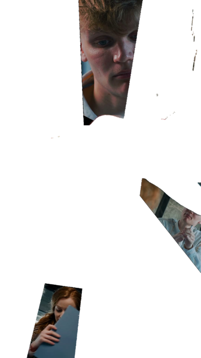
LAYER 01 · ON TOPTRANSPARENT VIDEO LAYERTrailer footage and the comic frame, pre-rendered with an alpha channel. Not editable.
LAYER 02 · UNDERNEATHPICTURE-IN-PICTURE LAYERSOne per replaceable region, each behind a fixed trapezoid mask. The user’s media goes here.
06 · THE RADIAL FRAME, TAKEN APART
01→
FIGMA STORYBOARDThe complete storyboard
02→
AFTER EFFECTS PRODUCTIONAll animation
03→
PREPARED ASSET SYSTEMMaster renders · slot map · transparent video
04
TIKTOK ASSEMBLYBy a production partner, in about half a day
06 · FROM STORYBOARD TO THE IN-APP BUILD
REFLECTION
The project reinforced how creative leadership can bring complementary ideas into a finished piece.
The final edit brought together my teammate’s split-screen and comic-panel direction, my Three Life Cycles story arc, and our shared poster-style cutout concept. As creative lead, I carried that combination through the storyboard, visual design, and all animation.
Her direction gave the edit its visual momentum; mine gave it an emotional arc. I planned the replacement logic and prepared the production package so a production partner could assemble the template within the mobile editor’s limits.
CREDITS
Creative lead: Siji Chen. Concept development: Siji Chen and a junior teammate. Split-screen transitions and comic-panel direction: my teammate. Three Life Cycles: Siji Chen. Poster-style cutout concept: shared. Storyboard, visual design, all animation, technical problem-solving, production planning, concept-stage mentorship, and cross-functional coordination: Siji Chen. Final in-app assembly: a production partner.